BRAND INNOVATION
Into the blue
The thoughts of designers within Samsung's blue
Pantone chose Classic Blue as its 2020 Color of the Year. It is not particularly known for its warmth, but it is a color that offers comfort. It carries the strength to console people living in this fast-changing modern world. “A boundless blue evocative of the vast and infinite evening sky, Classic Blue encourages us to look beyond the obvious to expand our thinking; challenging us to think more deeply, increase our perspective and open the flow of communication.” These are the words of Leatrice Eiseman, Executive Director of the Pantone Color Institute, explaining their choice for this year. Blue is a special color to Samsung as well. Ever since Samsung’s CI was renewed in 1993, blue has been the identity color for Samsung.

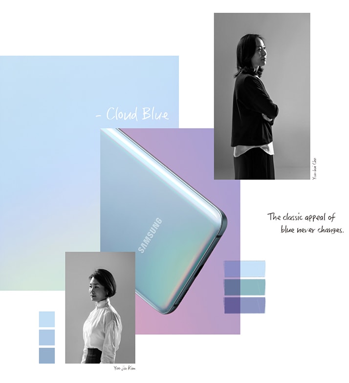
The Galaxy Smartphone came in various blue colors over the years, but the S20 has the brightest blue yet.
Yoojin Kim_ In the last few years, the Galaxy series has pursued a more youthful and gender-neutral brand. For the S20, we carefully considered neutral colors that provide comfort while naturally blending into any surrounding. That’s how we ended up on Cloud Blue.
Yunhui Cho_ The signature color of Samsung Electronics is blue, just as red is for Ferrari and yellow is for Lamborghini. Blue is a meaningful medium through which Samsung designers are reminded of their role and identity.
Yunhui Cho_ Blue changes each year based on different trends. However, the classical appeal of blue remains unchanged, and it has the special strength of harmoniously entering our everyday lives.
Yoojin Kim_ We were inspired by the sky above us that freely roams anywhere without bounds and can be seen by anyone at any time. The warm, soft, and soothing emotions of this color has the capacity to touch the lives of diverse users, regardless of gender or age.
Yoojin Kim_ Bright neutral colors can sometimes make expensive glass materials look like plastic. In order to retain the clear and pure attribute of glass, we worked with the product designer responsible for the exterior form and conducted countless tests with other collaborating teams.
Yunhui Cho_ I hope users experience the sensual appeal of this color that mystically transforms in different lighting or angles.
Yoojin Kim_ My aspiration is for users to experience a cool and composed kind of blue that calmly saturates our day-to-day lives.
Learn more about the Galaxy S20 here.

I’m curious about the color selection process.
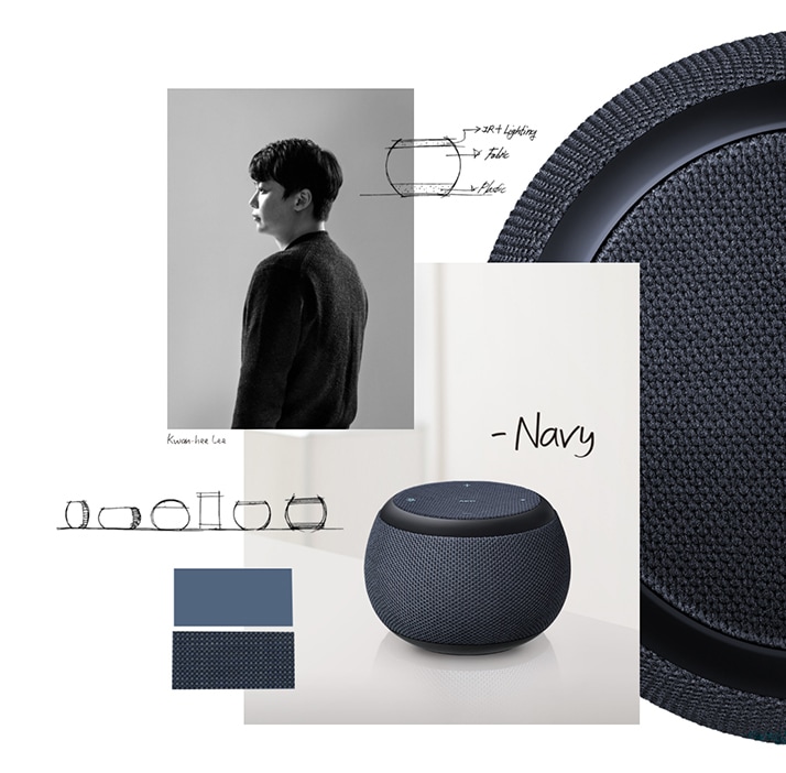
Kwanhee Lee_ In the process of choosing the Galaxy Home Mini’s color, we held a company-wide survey and collected color preferences from a lot of people. The results showed that there was a difference in The colors people preferred and colors they wanted to purchase. Navy was a color that could blend in any space with ease and was chosen as the color that people wanted to purchase the most.
Kwanhee Lee_ The core feature of this product is the IR control function that enabled the product to work as a remote control. A black plastic material had to be used in order to realize this function, and Navy was the ideal color to minimize any mismatch caused by the material and find balance throughout the product. It was the best solution to enhance the quality of the overall design.
Kwanhee Lee_ The elasticity of the fabric that is put on at the final stage of manufacturing played a pivotal role in terms of creating a seamless design. We needed a fabric material that had incredible elasticity, but this could potentially lead to the product having different weaving sizes depending on the product’s form. Navy turned out to be the perfect color to visually alleviate these flaws.
Kwanhee Lee_ That’s right. With fabric, contamination is always an issue. There is a higher chance of contamination because it is a product operated by touch, and fabric itself is affected by sunlight and humidity. Navy was chosen with all these scenarios in mind.
Kwanhee Lee_ When first designing the product, we were hoping that the design we create would be noticeably eye-catching. Now, rather than creating flashy designs that soon fade, we want to develop designs that could comfortably permeate into the lives of many people for a long time. Just like Samsung Blue.

Royal Blue seems like a bold color not often seen on laptops.
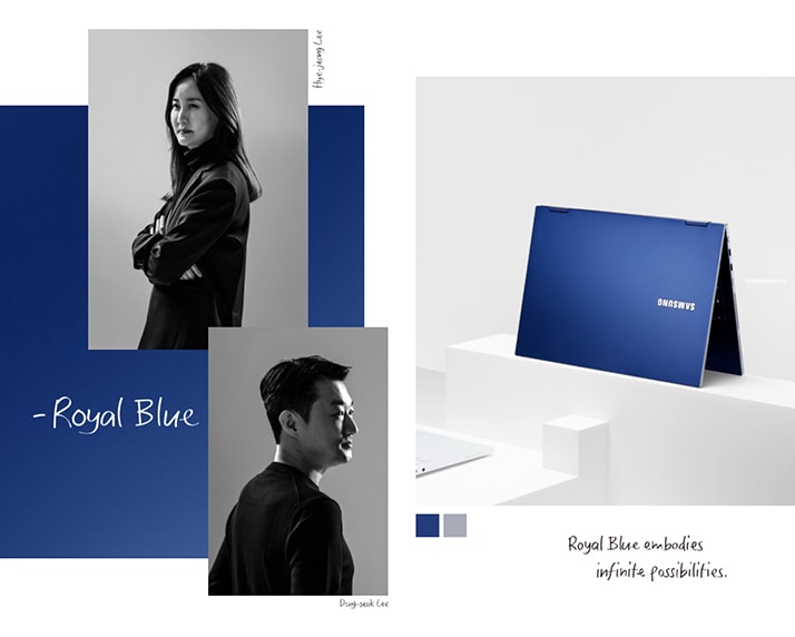
Hyejeong Lee_ As far as I know, this is the first time a color with such intensity has been used in a laptop design. We wanted to take a bold and fresh approach to CMF in accordance with the solidity design that emphasized a simple yet strong form. Blue was best suited for this approach.
Hyejeong Lee_ ‘Royal’ alludes to its symbolic nature and ‘Blue’ expresses stylishness and trust. We needed a powerful ‘impression’ since we’re not presenting a newly invented product. Tremendous effort was put into finding a deep and pure shade of blue, which led us to Royal Blue.
Dongseok Lee_ It’s a common color but not too obvious, and has a wide emotional spectrum depending on its depth. You may think it’s a familiar color, but you will soon notice its unique and novel appeal.
Dongseok Lee_ Blue is a stable and stylish color with a distinct presence. Metal shares these attributes as well. To maximize these shared elements, we fine-tuned the entire manufacturing process to focus on the details and be much more meticulously refined.
Hyejeong Lee_ A color with very vivid tones like Royal Blue is affected more by material and finish. For a sturdier and refined shade of blue, we implemented additional manufacturing processes such as adding more coloring work and increasing the brightness and density of the metal particles.
Dongseok Lee_ I wanted to express values of infinite possibilities, bright and formidable energy, confidence, perfection, and urban sentimentalities.
Hyejeong Lee_ I wanted this color to express the essence of the color itself in the context of the product and the pure passion toward the change in CMF in the perspective of a designer.

Sage Blue seems like a color that amplifies comfort. It feels calm the more I look at it.
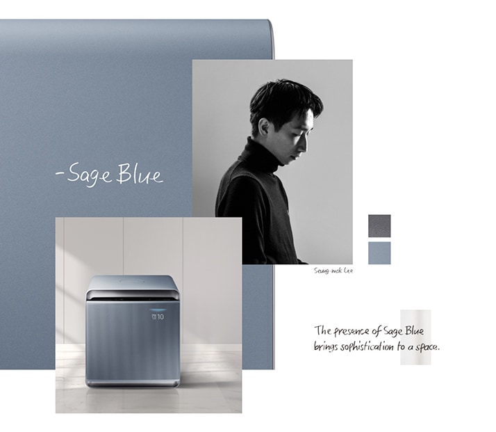
Seungmok Lee_ The motif was the color of pebbles glistening in crystal clear water. We further developed the tone based on essential features of the product such as its powerful purification abilities and quiet, Wind-Free function.
Seungmok Lee_ Considering the nature of an air purifier, we wanted to find a color that didn’t draw too much attention and blend well in any environment. We found that in Sage Blue, a blue that breathes life and fits perfectly in a clean space free of dust.
Seungmok Lee_ The color had to be deep and profound like nature itself, and its texture had to be matte to express comfortable emotions. We experimented with countless colors and particles, eventually discovering the most natural texture we could find. This helps different colors exude their unique particles and harmoniously come together to illustrate a single tone.
Seungmok Lee_ Home appliances now come in a wide array of colors to cater to the unique lifestyles of individuals. They have now become a crucial part of interior design, representing the tastes and sentiments of users. A color like Sage Blue that works well in any setting can elevate the elegance and style of a space.

Bumho Chun_ The Sero has been designed with the new generation in mind and is a product that pioneers new lifestyles. To make sure the incredibly innovative approach didn’t seem foreign or uncomfortable, we chose blue as its color to maintain stability while emphasizing novelty in its form and function.
Bumho Chun_ Like the term ‘Ancient Future’, we wanted users to experience a fascinating future in a familiar and safe environment. Navy Blue was the magical color we were looking for that has a stylish presence under light but can be quiet and undisruptive in the dark.
Bumho Chun_ Since we decided to use fabric, which is not usually used for TVs, we worked with a fabric manufacturer for the first time and had to cope with different lead times in production. Compared to working with resin or paint that had samples available in a matter of days, fabric or fiber samples took at least a month. Our efforts were focused on making strategic choices in limited time to create the best possible color.
Bumho Chun_ Designers have the innate mission to reinterpret colors based on trends, lifestyles, and product specifics and present them to users. With that in mind, blue gives Samsung designers a challenge to see things in different perspectives and find perfect balance.
Learn more about the The Sero here.
Original article from Samsung.com here.
You are invited
Get ready for exclusive access to in-depth features with thought leaders, invitations to bespoke events, editorial beats on innovation, and first dibs on the latest Samsung products. Join our mailing list today.
Subscribe


